

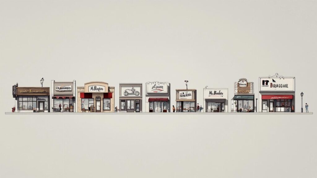
The landscape of home improvement retailing in France has long been defined by bold visual identities that anchor consumer trust and recognition. Among the most distinctive is the branding of Mr Bricolage, a company whose logo journey reflects not only its own evolution from a cooperative of independent hardware shops to a significant player on the Euronext Paris, but also the broader shifts in the do-it-yourself sector. Understanding how this French retail chain has shaped and reshaped its visual presence offers insight into competitive positioning against formidable rivals such as Leroy Merlin, and reveals the strategic thinking behind maintaining relevance in an increasingly crowded marketplace.
The Origins and Early Identity of Mr Bricolage: From Local Initiative to National Recognition
The Birth of Mr Bricolage: Franchise Model and Initial Branding Strategy in the French DIY Market
The story of Mr Bricolage begins not with a single visionary entrepreneur, but with a collective ambition shared by independent hardware store owners across France. In 1964, these retailers recognised the value of pooling their knowledge and resources, forming an information exchange group that would lay the groundwork for a more formal structure. By 1968, this collaboration had crystallised into the ANPF cooperative, a body designed to support small, locally rooted businesses in competing against larger chains emerging in the home improvement market. The ethos was clear: preserve the specialist credentials and proximity to customers that characterised these independent shops while gaining the purchasing power and shared expertise of a network. This cooperative spirit would prove essential in shaping the brand identity that followed, emphasising community ties and practical know-how over the impersonal scale of massive retail warehouses.
It was not until 1980 that the Mr Bricolage brand itself was officially launched, transforming the cooperative into a recognisable retail name with a clear market proposition. The choice of name was deliberate, evoking the image of a knowledgeable, approachable handyman ready to assist with any project, large or small. This persona resonated deeply in a market where customers valued guidance and personal service as much as product range. The initial branding strategy focused on establishing Mr Bricolage as a trusted specialist, capable of offering tailored advice and quality products without the overwhelming scale that could intimidate the everyday do-it-yourself enthusiast. This positioning was particularly important in differentiating the chain from competitors who were beginning to adopt the hypermarket model, prioritising sheer volume and variety over the nuanced expertise that smaller, community-focused retailers could provide.
Early Logo Design and Visual Identity: Establishing Proximity and Specialist Credentials
The early visual identity of Mr Bricolage was crafted to reflect the brand's core values of accessibility, expertise, and local presence. While detailed records of the very first logo iterations are sparse, the design principles were unmistakable: clarity, warmth, and a nod to the practical, hands-on nature of the DIY sector. The logo needed to communicate trustworthiness and competence, reassuring customers that they were dealing with a knowledgeable partner in their home improvement endeavours. Colour choices, typography, and iconography all played a role in conveying these messages, with a focus on creating an inviting presence that stood apart from the clinical, corporate aesthetics of larger competitors.
During this formative period, the visual identity also had to accommodate the franchise model that underpinned the Mr Bricolage network. Each store, while operating under the same banner, retained a degree of independence, and the branding needed to be flexible enough to allow for local adaptation while maintaining overall coherence. This balance was critical in preserving the proximity and personal touch that defined the customer experience, ensuring that shoppers felt they were engaging with a local expert rather than a faceless corporate entity. The logo, therefore, became a symbol not just of a product range or a retail format, but of a broader commitment to community and specialist service that resonated deeply in the French DIY market.
Evolution of the Mr Bricolage Visual Identity: Strategic Rebranding and Market Positioning Against Leroy Merlin
Logo Transformations Through the Decades: Reflecting Changes in Company Strategy and Product Range
As Mr Bricolage expanded its footprint, both domestically and internationally, its visual identity underwent a series of transformations that mirrored broader strategic shifts. The 1989 introduction of the Bricotruc store format, aimed at serving smaller towns and rural areas, signalled a willingness to diversify the retail offer, and the branding adapted to reflect this flexibility. By 1993, the launch of the Mr Bricolage branded product range marked another pivotal moment, as the company sought to offer customers not just access to third-party manufacturers but also a curated selection of goods bearing its own name. This move required a logo that could convey quality and reliability, reinforcing the notion that the Mr Bricolage brand was synonymous with trusted value.
The formal transition from ANPF to Mr Bricolage S.A. in 1995 represented a corporate maturation, as the cooperative structure evolved into a joint-stock company capable of attracting investment and scaling operations. This change was reflected in the visual identity, which needed to project a more polished, professional image suitable for a publicly traded entity. By the year 2000, the company had made a public offering on Euronext Paris and introduced a new large-scale store format designed to compete more directly with the likes of Leroy Merlin and other market leaders. The logo and broader brand identity had to communicate ambition and modernity while retaining the core values of expertise and proximity that had defined the early years. This balancing act was no small feat, as the company sought to appeal to a wider audience without alienating the loyal customer base that valued the personal touch of local shops.
Comparative analysis: mr bricolage's visual approach versus leroy merlin and other diy network leaders
To understand the distinctiveness of the Mr Bricolage visual identity, it is instructive to compare it with that of Leroy Merlin, a company established in 1923 and a dominant force in the French home improvement market. Leroy Merlin's branding journey offers a striking contrast. Its first logo, used from 1968 to 1980, featured black and white text with a stylised lady's silhouette incorporated into the letter 'O', a quirky touch that nonetheless conveyed a certain domesticity. The second iteration, spanning 1980 to 1996, adopted a green triangle with the company name, a geometric simplicity that suggested stability and growth. The current logo, in use since 1996, retains the green triangle but positions the name on the sides, creating a clean, modern look that has become instantly recognisable across Europe.
Where Leroy Merlin's branding has emphasised bold geometry and a strong, singular visual motif, Mr Bricolage has historically favoured warmth and approachability. The difference reflects underlying strategic priorities: Leroy Merlin, with its extensive product range and large-format stores, has positioned itself as a one-stop destination for all home improvement needs, leveraging scale and efficiency. Mr Bricolage, by contrast, has maintained a focus on specialist knowledge and local presence, with a visual identity that underscores these values. This divergence is not merely aesthetic but speaks to fundamentally different approaches to market positioning, with Mr Bricolage choosing to compete on service and expertise rather than sheer size. Other market leaders, from international chains to domestic specialists, have each carved out their own visual niches, but the Mr Bricolage logo remains a testament to the enduring appeal of community-focused retailing in an era of consolidation and homogenisation.
Contemporary Brand Presence and Future Direction: The Role of Visual Identity in Omnichannel Strategy
Current logo implementation across physical shops, online platforms, and social media networks
In the contemporary retail environment, a logo is far more than a simple mark on a shopfront. It is a versatile asset that must perform across a multitude of touchpoints, from physical stores to online platforms and social media networks. For Mr Bricolage, the challenge has been to ensure that the visual identity remains coherent and impactful whether encountered on a high street in La Chapelle Saint Mesmin, on a website browsed from a tablet, or in a social media advertisement viewed on a smartphone. The logo must be instantly recognisable at scale, on a building façade, and equally legible when reduced to a tiny icon on a mobile app. This requires a design that is both distinctive and adaptable, capable of maintaining its integrity across diverse media and contexts.
The company's expansion into international markets, including Portugal, Spain, and further afield to locations such as the Ivory Coast, Gabon, Kosovo, and Cyprus, has added another layer of complexity to brand management. The logo must resonate with diverse audiences, each with their own cultural expectations and aesthetic preferences, while remaining true to the core values that define Mr Bricolage. This balancing act is evident in the careful implementation of the visual identity across different regions, where local adaptations are permitted within a framework of overall brand coherence. Online, the logo serves as a gateway to a comprehensive digital experience, guiding customers through product catalogues, gardening advice, and decorating inspiration, all the while reinforcing the brand's commitment to expertise and service. Social media platforms offer yet another arena for engagement, where the logo becomes a symbol of community and shared passion for home improvement, connecting customers, staff, and the broader network of independent retailers who embody the Mr Bricolage ethos.
Strategic Vision Under Leadership: Christophe Mistou's Influence and the Independent Retailer's Path Forward
Leadership has played a crucial role in shaping the strategic vision that underpins Mr Bricolage's visual identity and broader market positioning. Under the guidance of key directors, including figures such as Christophe Mistou, the company has navigated a rapidly changing retail landscape, balancing the demands of digital transformation with the enduring value of physical presence and personal service. This leadership has championed the idea that the logo is not merely a decorative element but a strategic asset that communicates the company's values, aspirations, and competitive differentiation. The emphasis on maintaining the independent retailer's spirit, even as the company has grown into a significant player with substantial turnover and a national presence, is reflected in the visual identity, which continues to evoke the warmth and expertise of the local hardware shop.
Looking ahead, the role of visual identity in Mr Bricolage's omnichannel strategy will only grow in importance. As the DIY sector becomes increasingly competitive, with established leaders like Leroy Merlin and new entrants vying for market share, the ability to communicate a clear, compelling brand story will be essential. The logo, alongside broader branding elements such as packaging, in-store signage, and digital design, will serve as the connective tissue that binds together diverse customer experiences, whether in a garden centre, a decoration aisle, or an online checkout. The company's commitment to development, both in terms of product range and geographic reach, will require a visual identity that is both rooted in tradition and responsive to innovation. For Mr Bricolage, the journey from a cooperative of independent retailers to a publicly traded company with international ambitions has been marked by strategic rebranding and thoughtful evolution. The logo, in all its iterations, remains a powerful symbol of that journey, embodying the values of proximity, expertise, and community that continue to define the brand in a crowded and dynamic market.